Saturday, 21 December 2013

The language of process.

Street clock - Manchester City Centre
Fluid Forms and John Briscella
2008
acrylic

Fluid forms are a company that allow customers to design their own unique furniture. The customer can enter their own postcode, or a postcode of their choice and zoom in and out until they are happy with the final placement. The data is then sent to a laser cutter, which cuts out the clock face from a sheet of acrylic or wood. 


I think this is hugely relevant to my own work. During the Sampling unit I will be learning how to operate the laser cutter, and it's definitely something I would like to use within my work. I also believe it's relevant as the sampling project is based on mapping.


I really like this piece as it's very accurate and the lines and shapes reflect something personal to each person, as it's of their home town, or somewhere they enjoy visiting. 
The clock is very linear, and made up of lines and curves. 


Wednesday, 18 December 2013

Jee Young Lee

JeeYoung Lee has turned her limiting studio space into her imagination, where the possiblties are endless. Instead of finding a new location, or using digital processes to trick the viewer, she converts her small space in Seoul, measuring 3.6m, 4.1m, 2.4m into the most elaborate sets imaginable, just to take one photograph.

JeeYoung Lee won the Sovereign Art Prize in 2012, and she will be opening her first European exhibition at Opiom Gallery in Opio, France. The exhibition will be names Stage of Mind, and is starting February 7, 2014.

I feel this artist really reflects the mixed media subject, however digital processes like illustrator, laser cutting, and the 3D printer will be involved, there are no limitations in where I can take the sampling brief.


Monday, 9 December 2013

Manchester Art Gallery

I spent nearly an hour and a half in the Manchester Art Gallery, and particularly in the Grayson and Perry exhibition. I thought his work was very apt for the brief of mapping and the collection of data. The tapestries that he has created mark an event or moment in time that he has captured adequately. The amount of time taken to design and produce these tapestries in tremendously impressive. 


Firstly he begins my mapping the image that he has witnessed, and trying to portray the story or a way of life.
 The final installations are very large in scale, which gives a great impact on the viewer. I spent over an hour looking at this exhibition, as each strand of thread represented a hidden message, feeling or opinion. I was very inspired by his work. 


Sampling project

After reading the brief, I began to think about the words 'mapping' and 'data', and the thought of taking a journet somewhere in Manchester. After doing some research into current events, I was keen to visit The Manchester Art Gallery, to see the Grayson Perry exhibition. 
I began by mapping my route to the Manchester Art Gallery. Firstly, I live in Davenport, so I have to get a train in to the centre, Manchester Piccadilly station. I used google maps and photographed the street signs and jotted the street names down. 


Wednesday, 20 November 2013

Origins Evaluation

Evaluating my project, I can see clearly, that some areas are stronger than others. My initial research of the city was interesting in shape and composition. However, I did not spend enough time finding and capturing images that I was particularly interested in. This is an important lesson, and one that I should already know, as it's hugely important to enjoy drawing your found research, you must be inspired and excited by your chosen subject.

I began producing drawings and developing my ideas. Drawing is so important in this early stage and through the entire project. Simply sketching an image or any ideas I have can generate so much, and allows me to have a thorough sketchbook. It took me a while to shake off the idea of creating the "perfect drawing", however the chance cards and the Friday drawing class really helped me in doing this.

When developing my research, I focussed on the shapes, and I found the illustrator and photoshop workshops to be extremely beneficial in achieving these shapes. I had very limited knowledge using the adobe package, however I feel like I have excelled in this area, and wanted to try to portray all of the learnt techniques in my work.

I was most excited for the screen printing sessions, however I feel that this is a long winded process. Perhaps this is because of my chosen motif's. I wasn't particularly happy with my finished motif's, especially once I had seen my final screen. This is because I hadn't given myself a long enough period to plan the layout and scale of these motif's. I think choosing our final motif's was quite rushed, and I wish I had had more time to develop my ideas.

Even though I was unhappy with my screen, I had plenty of opportunity to develop new motifs and these were incorporated in my hand drawn processes and digital design. My original research included the image of a gothic museum situated in Dundee. I had based the majority of my motifs around this one image, so I decided to collect further imagery linked to this theme. I went into the city again, and captured some striking photographs of the John Ryland's library. I loved the window and archway silhouettes, and I knew they would be great shapes to sketch.

Further development of my research was extremely useful, and I began to think about my final designs and what they would or would not include. I found it quite difficult to keep hold of my chosen colour palette, as the original image I had chosen contained a range of colours, shades and tones. However, after attending my group tutorials, with the advice that I was given from my tutor, I tried to portray the palette through my digital designs, as I had the luxury to include all of the colours with out the process taking too long.

I think the key issue during this project was time management. I did not set myself weekly targets of completion, therefore in the last week of work, I found myself rushing through a check list of work. This is a learning curve, and I believe my future projects will be more organised and I will use my independent study more wisely.

Final samples


I'm really happy with both of these final designs. I began by tie dying my fabric, creating a distressed look, and circular pattern. I then cut out a stencil on wax paper, and I also used the stencil negative. I screen printed over the top of this, and then hand painted on a blank screen. I think the final outcome is busy, but it really works, and I have finally reconstructed the correct colour from my palette. 


Sunday, 17 November 2013

Artist research


Publisher Textiles

These designers produce many limited edition prints. Their work is extensive and extremely influential. I like these images of their work, particularly because they have used motifs rather than a repeat pattern. 


Wednesday, 13 November 2013

Print influences


Timorous Beasties

I really love this designer. I think their prints are very fitting with what I have learnt in my first Origins project. Using beautiful motif's, and layering them to create more depth. These print artists are also Glasgow based designers, and they reflect this by including the Scottish thistle in their work. 


Friday, 8 November 2013

Dying fabric


After developing my research, I started to dye my fabric backgrounds. I started to explore tie dying to create interesting shapes and marks. I really like this effect, as it's a great starting point to screen print over. 
I also think these samples represent what I have been learning in the Friday drawing classes. I have tried to create marks in different ways, using folding techniques and elastic bands.


Thursday, 7 November 2013

Making marks

Making marks

In the last drawing class we were asked to bring in an object that we could deconstruct. To make things easy, we all brought in a kinder egg, so that we could deconstruct and reconstruct the free toy, and use each piece to make marks on our paper.
This class was really enjoyable as I like the freeness of simply mark making with my object. I used indian ink and gouache.

This drawing is using the kinder egg itself, dipped in indian ink.
This was simply using my key, to draw with the indian ink, and then adding water to dilute. I then moved the piece of paper from side to side, to let the water move across the surface.
This drawing is again, simply using the key to draw lines up and down the paper, I think this is a great surface to work over.
Using gouache and simply a flat square brush, I made strokes with the paint, and allowed the paint to ware off the further down the paper that I got.
This drawing is gouache with white indian ink applied over the top.

Monday, 4 November 2013

Print World - developing motif's

Motif development

I began to look at the windows of churches, cathedrals and even libraries, particularly the John Ryland's library in the centre of Deansgate. The gothic shapes and stucture of the building and particularly the windows are  reallly interesting, and I think they would be visually distinctive on adobe illustrator and photoshop.


Saturday, 2 November 2013

Print world - development


Colour Mood

We were asked to select an image where the colour mood was visually pleasing. We were to question the proportion of colour in the image and how that would effect our finished designs as they would have to reflect this proportion accurately. I choose an image that contained a large amount of white, so I cut the image down, and focused on a mix of purple, green brown and blue tones.

The previous Friday drawing class that we had done in creating a colour wheel and exploring different tones and shades really benefitted me in creating my chosen colour palette. I also really enjoyed working with gouache as it was a media that I hadn't used previously before.

Developing motif's

Using the images I had taken of the churches and of the John Ryland's library I began to develop my ideas and also started to generate motif's which would be made into a screen to be taken into the print room.

This is a particulary detailed drawing using indian ink. I spent quite a bit of time generating this drawing however it has really opened up a lot of ideas and I can use many of the elemants of this drawing to create motifts for my screenprint and digital classes.

                                                       
Monoprinting is a great way of generating quick drawings, and the majority of the time, I love the results as they are extremely free, experimental, and always slightly different than the one before. 

Friday, 1 November 2013

Friday Drawing Class

Shoes

Drawing is one of my least favourite activities, however I have learnt the importance of drawing, and how many ideas you can generate from just sketching an object or an idea. During the Friday drawing classes we have been exploring lots of different techniques and ways in making marks. We have also been introduced to the gouache media, which I had never used before.

We were asked to draw different shoes and interesting compositions. Again, many of my drawings were line drawings, however my final drawing in which I used gouache to portray the colour and tone, I think works well. 


Thursday, 10 October 2013

Textile world

Textile world and drawing
 
I carried on exploring the chance cards, and began to experiment with my own techniques. One of the drawings I particularly enjoyed, was of a classic, glass sugar shaker. I used ink, and water to create a tonal image, trying to capture the shadow and light. 


Using indian ink and then water to diute. This technique could be advanced in many way, and in the next drawing I do, I may wet my paper first before applying the Indian ink, as this would create a much more abstract drawing.


Afterward drawing the image with ink, I cut it up into small pieces and muddled them up and re-lay them onto a piece of paper. I like this affect, as you would have to document the narrative of this process for the viewer to understand where the image was formed from; like a story.


After a meeting with my tutor, we decided that I would be best suited for the Print Textile World. And Embroidery as my second world, however I do feel this may change.


Tuesday, 1 October 2013

Origins - Map the City


Mapping the City - Photographic research
 
We began to capture interesting compositions and shapes within the city. I found myself drawn to circular shapes and brick work.
I wanted to research why I may be drawn to circular shapes and I found that the most common meanings of a circle are unity, wholeness, and infinity, as the shape is without a beginning or an end. 
We were given chance cards to help us develop the photographs that we had taken. The cards really helped me begin to explore different ways in experimenting with not only the drawing itself, but the surface that I was drawing on.
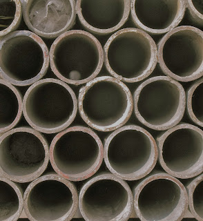

 
This is scaffolding piled up outside of a building site. Really like the repetitiveness of it, and also that the shadow itself makes its own repeat pattern.

 
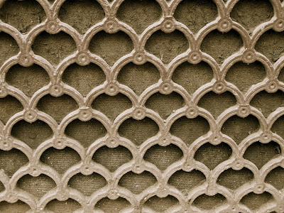
This pattern is the vents on the side of a cathedral. Again it's a repeat pattern. This indicates to me that I may be suited for the print textile world. I'm already thinking of how I could develop these images. I think using a lino cut of a segmant of this pattern would create a interesting motif.

 
Development
 
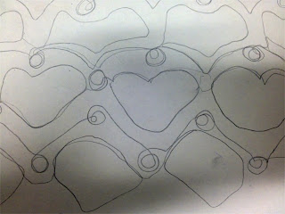
 I really enjoying developing my imagery with simple line drawings.
I experimented with line drawing, by looking away from my surface, blindfolding myself and using my left hand.
I also used a collage effect. Trying to make similar marks with different media.
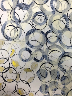


Firstly I used masking tape to create a surface for my drawing. I used found circular objects dipped in indian ink. I also used white ink on black cartridge paper, and then cut this up into circular shapes. I like the idea that these shapes, were an image beforehand.


I like using simple line drawing, as it's less pressure to create the original image. It's very lose and quick, and it can generate lot's of ideas for further development.